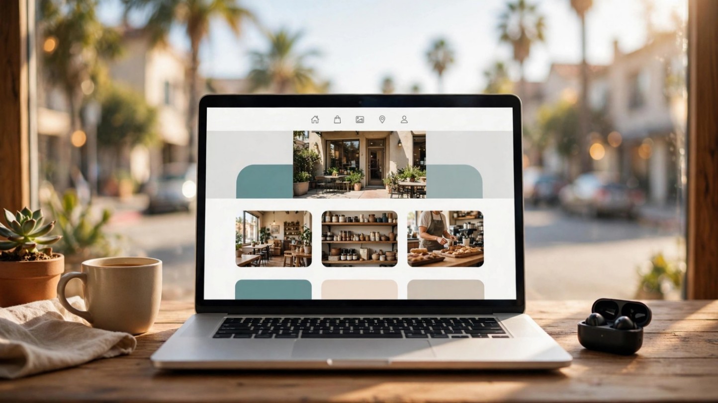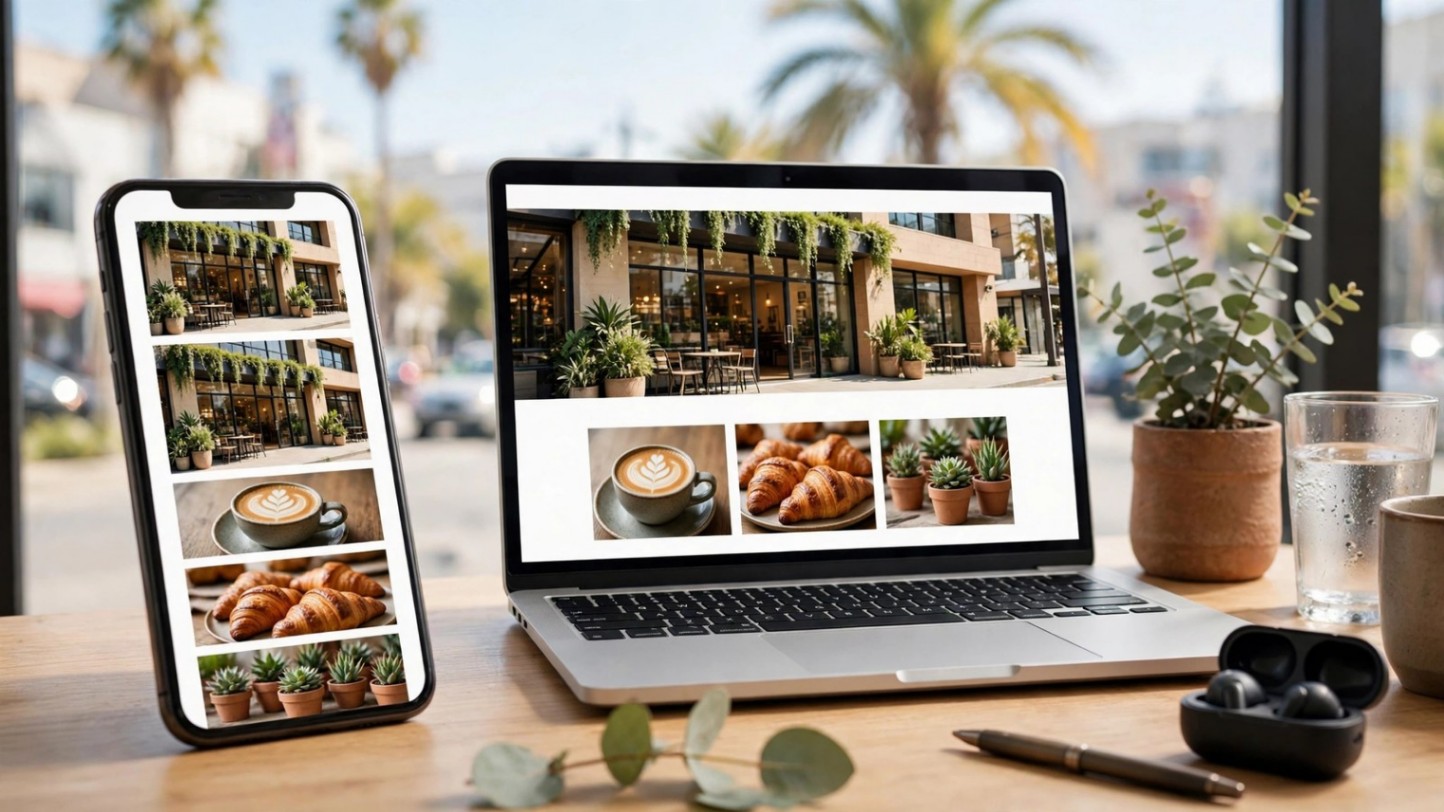
My post on hiring a web designer touched on mobile briefly. This is the deep version — because "make it responsive" is where a shocking number of Costa Mesa web design projects quietly fail. Responsive doesn't just mean "it fits on a phone." It means Google judges your site by its mobile version, your customers experience it thumb-first, and speed decides whether they stay. Here's what that actually means, and what to demand from whoever builds your site.
What does mobile-first indexing mean for my site?
It means Google predominantly uses the mobile version of your site for ranking — not the desktop version. If your mobile site is a stripped-down afterthought with missing content, hidden pages, or a clumsy layout, Google ranks that. Plenty of businesses have a gorgeous desktop site and a mobile experience that silently tanks their visibility. When you review a developer's work, review it on your phone first. That's the version Google — and your customers — actually see.
What are Core Web Vitals — in plain English?
Google's speed and experience scorecard, boiled down to three things. How fast the main content loads (if your hero image takes forever, you fail this). How quickly the page responds when someone taps something (a button that feels dead for a second feels broken). And whether the layout jumps around while loading (text shifting just as someone tries to tap a link is maddening). You don't need to memorize the names — you need a developer who treats all three as requirements, not nice-to-haves, because Google uses them as ranking signals. A concrete example: that full-screen hero video that looks stunning on desktop is often the single thing murdering your mobile score. On phones, swap it for a lightweight static image. Nobody mourning the video ever outweighed the customers lost to a six-second load.
How do I check my site's mobile speed right now?
Run your URL through Google's PageSpeed Insights — it's free and takes thirty seconds. You'll get a score and a color: green is good, orange means work to do, red means customers are bouncing. Don't obsess over a perfect 100; focus on the big red items, which are usually oversized images, too many scripts, or cheap slow hosting. Screenshot the results and send them to your developer with one question: "what's the plan for the red items?" Their answer tells you everything about how seriously they take mobile.
What does thumb-friendly design actually look like?
It looks like a site designed for a thumb, not a mouse. Buttons big enough to tap without zooming — if you have to pinch to hit "call," it's broken. The phone number as a sticky tap-to-call button, always one tap away. Forms with as few fields as physically possible, because nobody types their life story on a phone. Text readable without zooming. Menus that open with one tap and close just as easily. None of this is exotic — it's just design that respects how people actually hold the thing.
Why does tap-to-call matter so much for local businesses?
Because for most local businesses, the conversion is the call. Nobody fills out a contact form from a parking lot — they tap the number. Every extra step between "I found you" and "I'm calling you" costs you jobs: a phone number buried in a footer, a number that's an image instead of a link, a site where tapping the number does nothing. One sticky, tappable phone number, everywhere, always. It's the highest-ROI element on a local mobile site and it takes an afternoon to get right. Test it the way a customer would: search for your business on your phone, tap through from Google, and try to call yourself. If anything in that chain feels awkward, fix it before spending another dollar on marketing.
Is "responsive" enough, or do I need a mobile app?
For almost every local business: responsive is enough. Apps make sense for products people use repeatedly — banking, food delivery, fitness tracking. Nobody is downloading your plumbing company's app. A fast, responsive website that works perfectly in a browser covers every customer you'll ever have, costs a fraction of an app, and doesn't ask anyone to install anything. If a developer pitches you an app before your website is excellent, they're selling you a yacht before you've learned to swim.
How do I brief my designer on mobile requirements?
Hand them this list and watch their reaction. The good ones will nod; the rest will change the subject. One: a speed budget — the site must hit green on mobile PageSpeed before launch, in writing. Two: every key action tappable with a thumb, no pinching, on a real phone — not just in a desktop browser's mobile preview. Three: a sticky tap-to-call button on every page. Four: forms cut to the bone. Five: test on actual devices, plural, before you sign off. If you're hiring for responsive web design in Costa Mesa, this list separates the professionals from the template-installers in one meeting. And put the speed requirement in the contract, not just the conversation — "must score green on mobile PageSpeed at launch" is enforceable, while "should be fast" is a wish.
The bottom line
Responsive isn't a feature — it's the whole game now. Google ranks your mobile site, your customers live on their phones, and speed plus thumb-friendly design is what turns "found you" into "hired you."
One seasonal note: holiday shoppers are overwhelmingly mobile shoppers. If you haven't yet, run through my holiday website checklist too — the mobile checks in it pair directly with everything above.
Get in touch — I build fast, mobile-first websites for Orange County businesses, and every one of them is tested on real phones before it ships.